Three fields, five levels, zero visibility
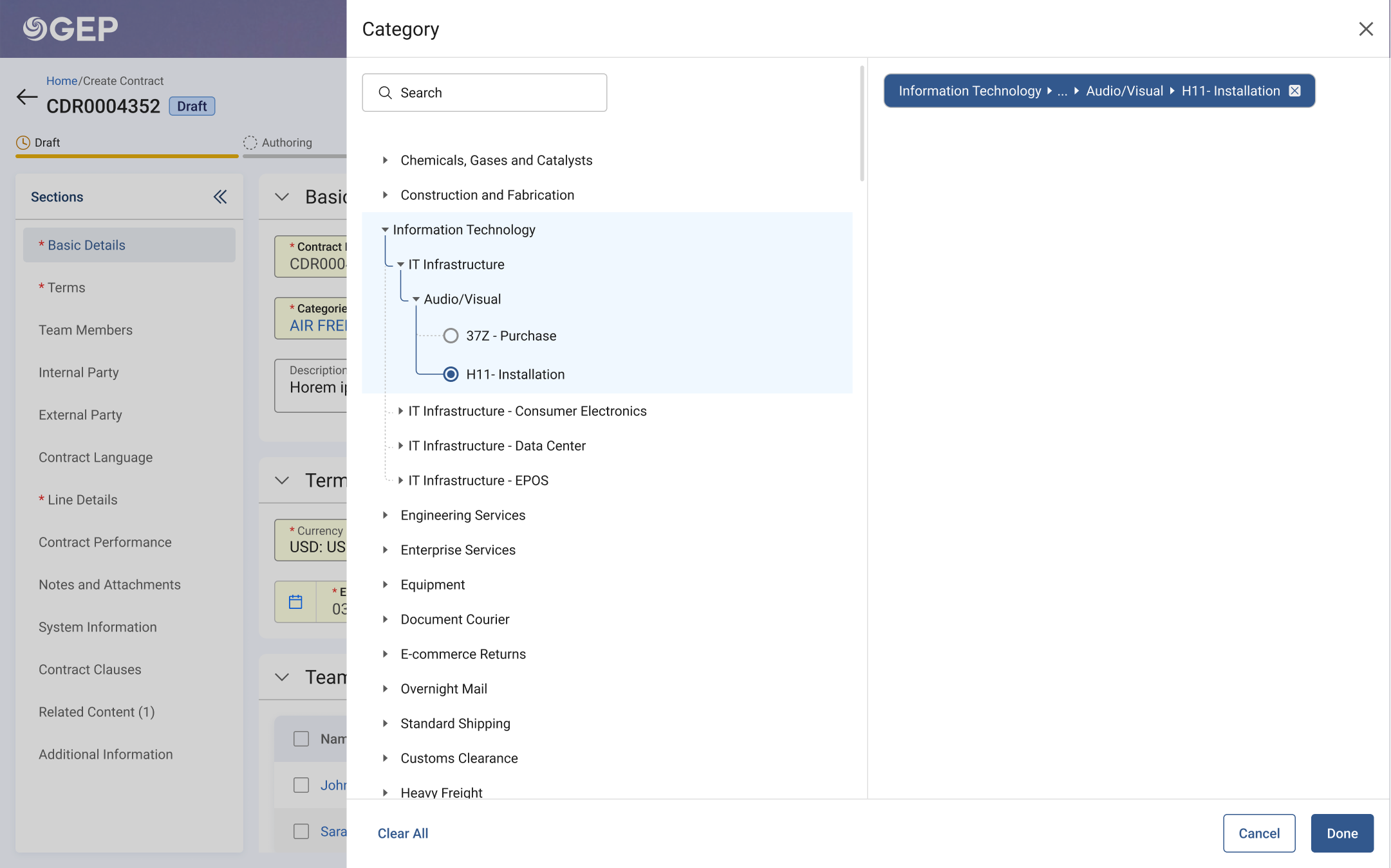
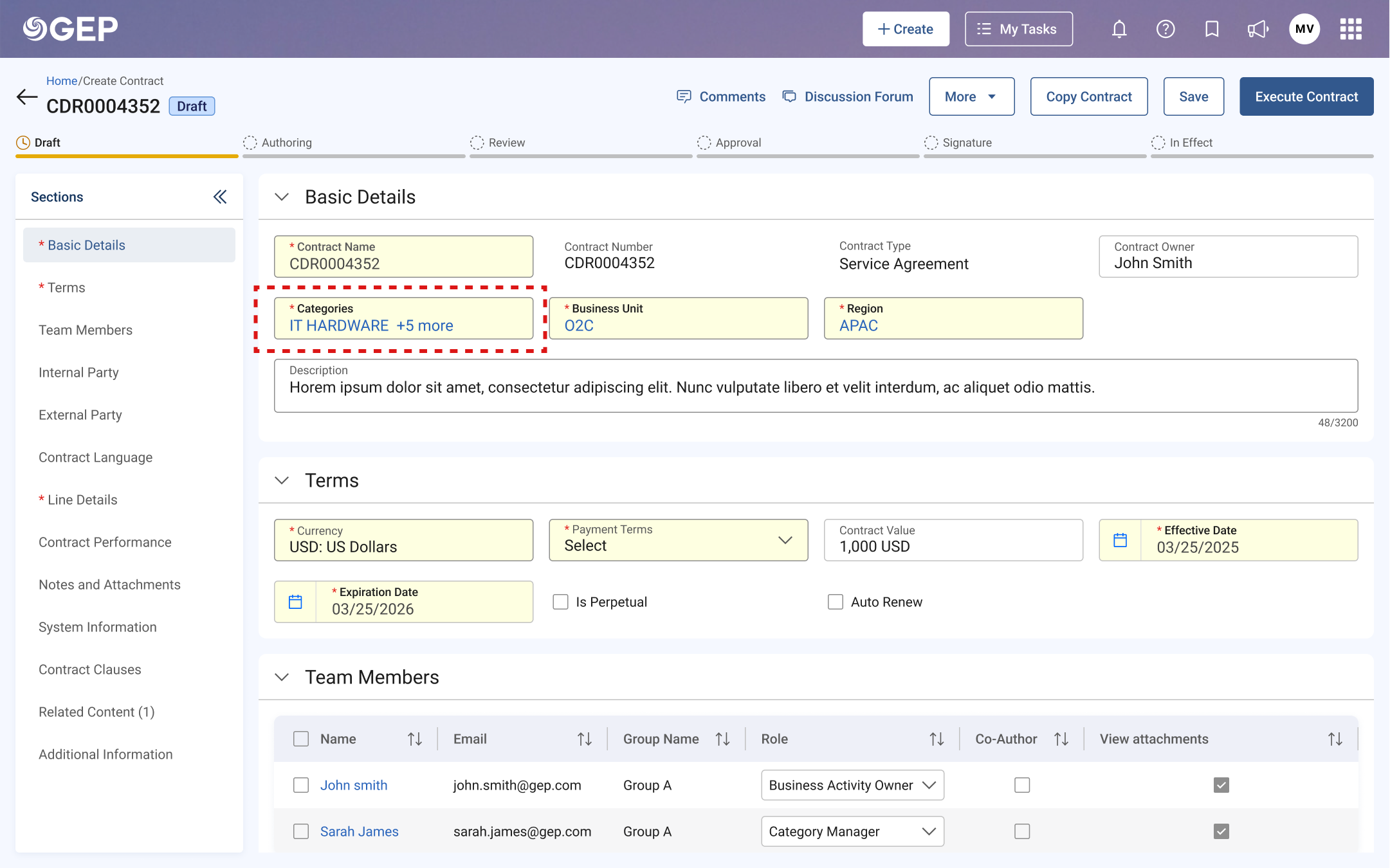
These three fields show up everywhere: contracts, purchase orders, invoices, every document in the platform. They look like simple dropdowns. But "Category" alone can go five levels deep: Information Technology → IT Infrastructure → Audio/Visual → Purchase → H11-Installation. The interface showed none of this. You'd pick something, see a single label, and have no idea where it actually sat in the tree.
Hidden hierarchy
Five levels of taxonomy, flattened into a single list with no parent-child context.
Ghost selections
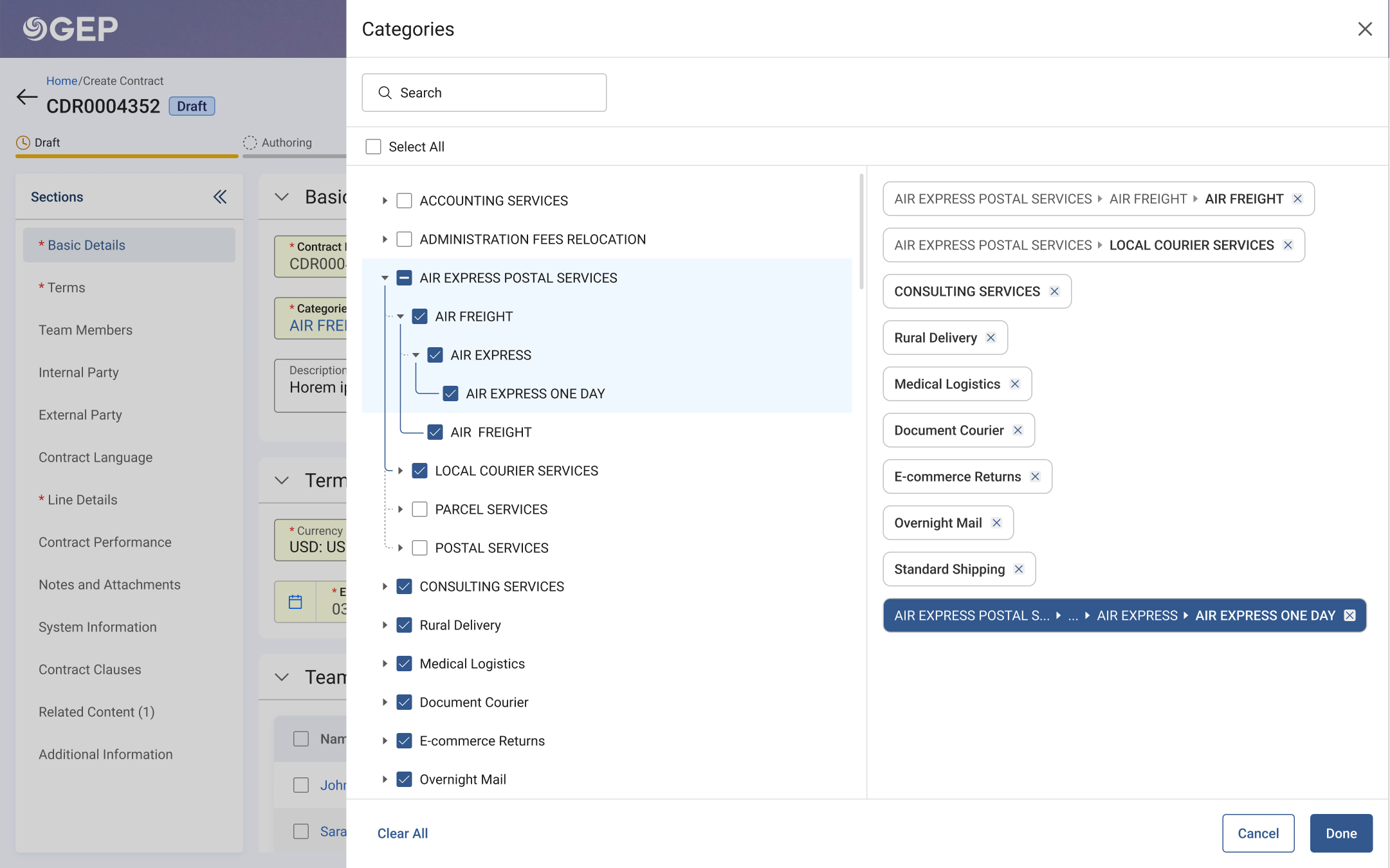
A "+2 more" link that opened a panel, but with no way to see, edit, or confirm what was already selected.
Disabled radio buttons
Parent nodes had radio buttons that didn't work. No explanation why.
Weak search
Results without context. Same label across branches, no way to tell which.
Two directions, twelve users, two rounds
I began by auditing the existing component across every module it appeared in: Contracts, P2P, Sourcing, mapping where the same CBR (Category, Business Unit, Region) fields surfaced and how differently each module's users interacted with them. The problem wasn't just visual; it was structural.
Exploration: Two prototypes
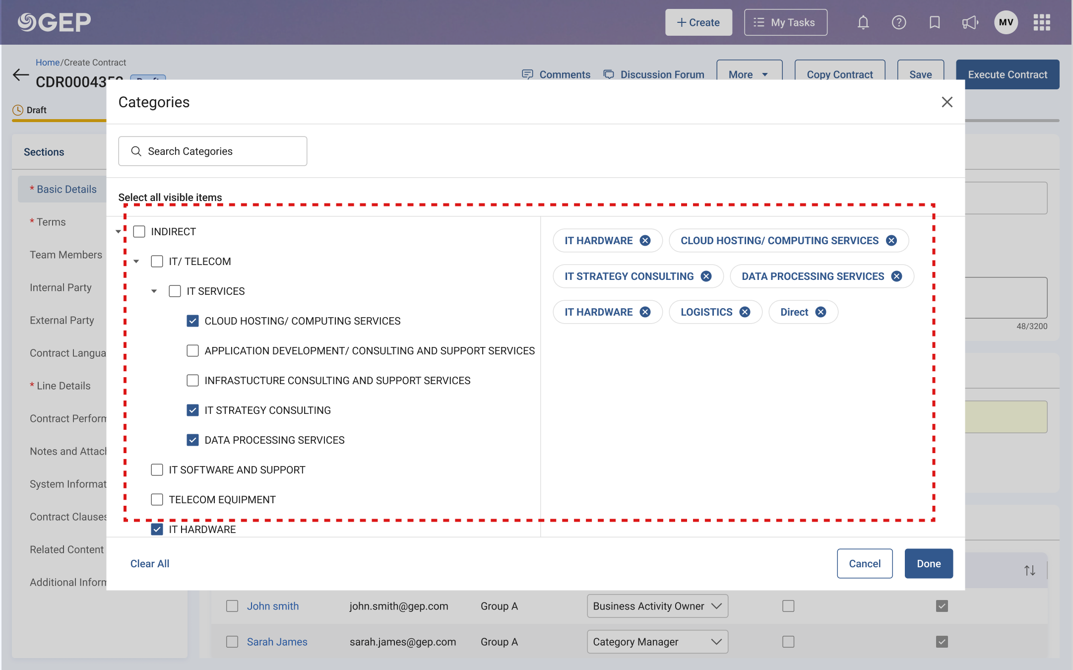
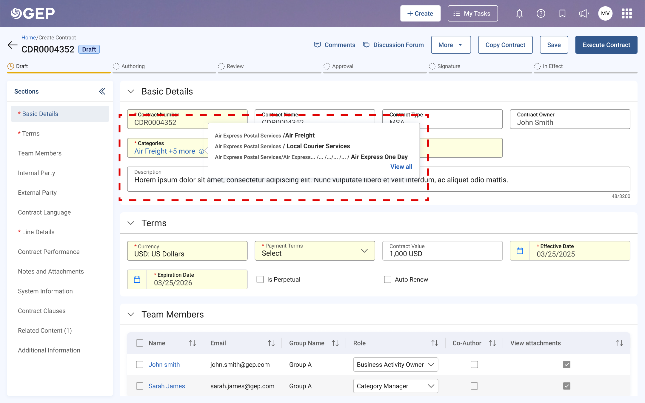
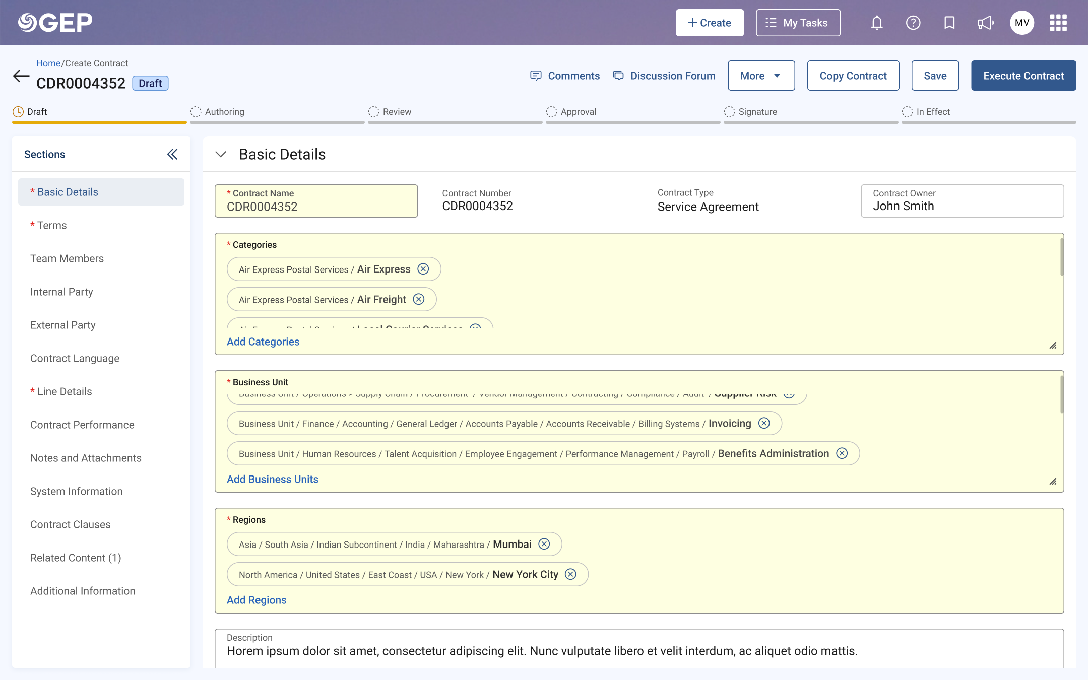
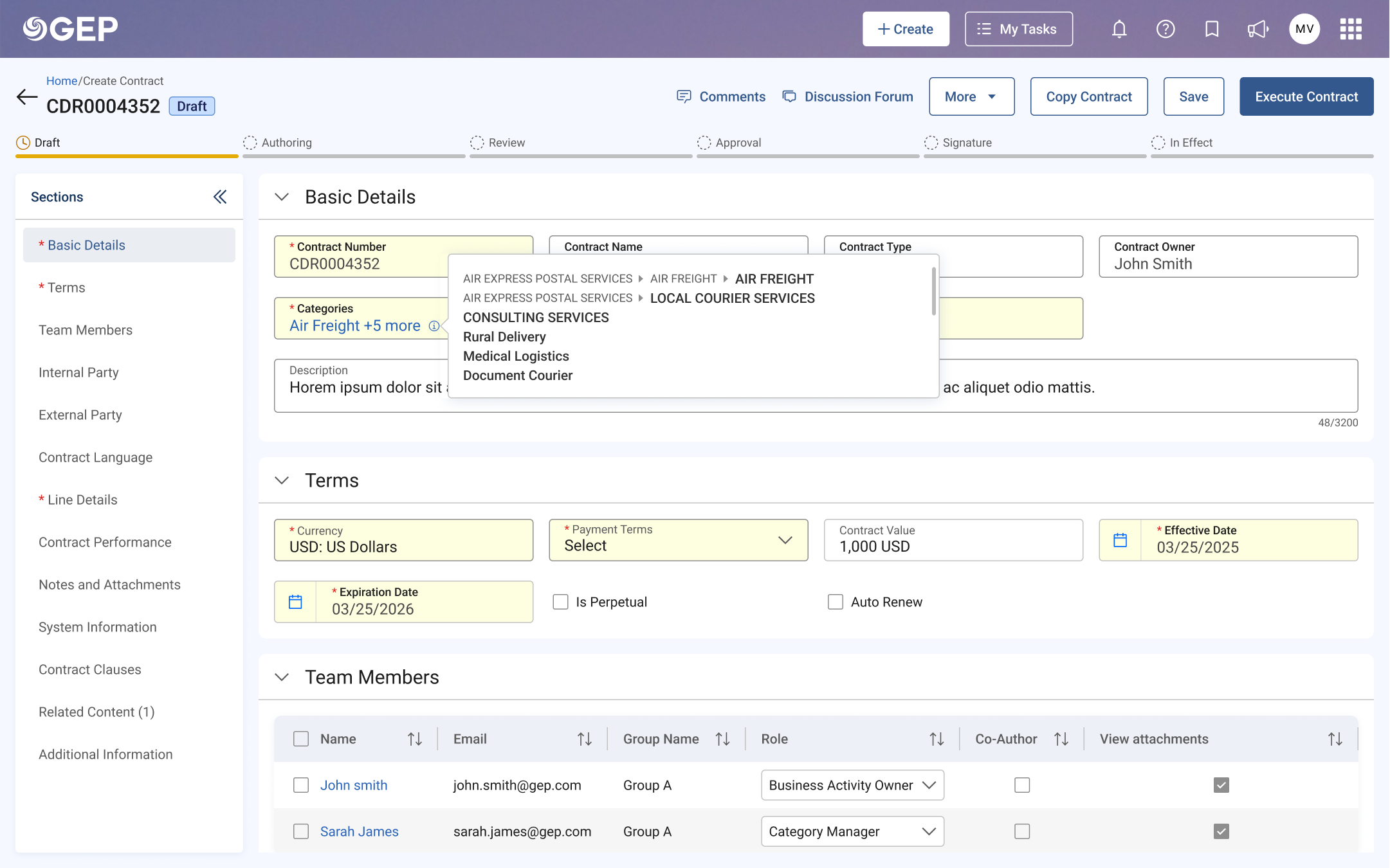
We explored two directions. Prototype 1 was a slide-out panel with an expandable tree and an i-icon that revealed all selections on hover. Prototype 2 expanded everything inline — each selection showing its full parent path as a chip directly in the form.
Round 1: A/B testing with Contracts TSOs
6 moderated 1:1 interviews, 30-minute sessions on Teams + FigJam. Akshita Verma (researcher), Nikhilesh Shetty and I (designers) watched users attempt real tasks across both prototypes.
Round 1 outcome
6 out of 6 users preferred Prototype 1. Prototype 2 took too much space and the inline chips made the form feel cluttered. The i-icon tooltip approach was universally liked — all users found it efficient for confirming selections without reopening the picker.
Iteration: Refining the hierarchy for Round 2
With the approach decided, I focused on the hierarchy problem. Replaced slash separators with arrow indicators, switched dotted connector lines to solid, and refined the tree's visual language for clearer parent-child relationships. Then validated with a completely different use case: Procure-to-Pay.
Round 2: Usability testing with P2P TSOs
Another 6 TSOs, P2P specialists. New team composition: Rupashree joined as co-designer, Akshita continued as researcher. Focused on hierarchy comprehension, tree navigation, and search results clarity.
What twelve users taught us
usability rating
highlighting useful
Round 1
What worked
The i-icon for viewing selections Round 1
All 6 Round 1 users found the i-icon tooltip efficient for seeing all selections with their full paths, without reopening the picker.
Arrow indicators for non-selectable nodes
Scored 4.5/5 in Round 2. Users immediately understood which items were navigational vs. actionable.
Parent-child highlighting on selection
When selecting a child, the entire hierarchy path lit up. All 12 users called this "very useful."
What needed rethinking
Three-dot indicator caused confusion
5 out of 6 users were confused by the three-dot icon. It split preferences: some wanted full tree, others just the child.
Dotted lines had poor visibility
4 out of 6 users found the dotted connector lines too subtle to trace hierarchy relationships at a glance.
Slash separator was unintuitive
4 users preferred arrows or breadcrumb-style indicators that more naturally conveyed parent-to-child relationships.
Showing the tree, not just the fruit
The final design was a slide-out category picker that made hierarchy the hero instead of hiding it. Every design decision tied back to a specific research finding.
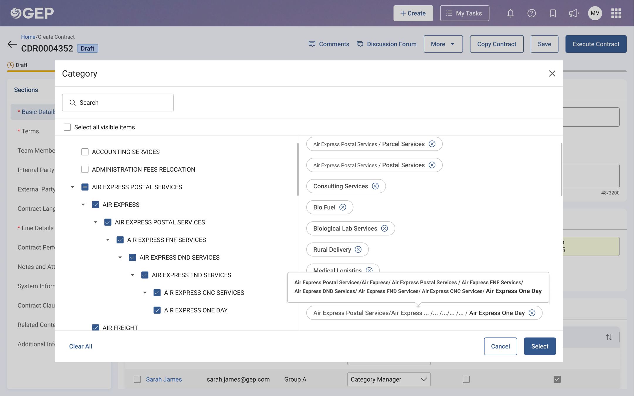
The tree structure became the primary view, expanded, clear, with solid connector lines replacing the too-subtle dotted lines flagged in Round 2. Arrow indicators replaced disabled radio buttons on non-selectable parent nodes, making it immediately obvious which items were navigational and which were actionable.
The confusing three-dot indicator was removed entirely, replaced by a breadcrumb-style path display at the top of the panel that showed exactly where you were in the hierarchy at all times.
The info icon tooltip stayed. It was universally loved. Click the small "i" on any input field, and the full parent-to-child path unfolds in a compact tooltip. No need to reopen the picker just to confirm what's been selected.
Search results now showed contextual hierarchy. Find "H11-Installation" and you'd see the full branch path right there in the results.
Designed for the extremes, not just the happy path
Enterprise taxonomy isn't neat. Some clients have 3 levels, others have 6. Category names range from "IT" to 120-character procurement strings. If the design only works for textbook examples, it doesn't work at all.
6-level category tree
Tested with a real CAT structure (Chevron's 4-level + extended 6-level taxonomy) to ensure the tree didn't collapse or become unreadable at depth.
120+ character names
Procurement categories like "Professional Services > IT Infrastructure > Cloud Migration & Modernisation" needed graceful truncation with full-path tooltips.
Single-level flat lists
Not every client uses deep hierarchy. The same component needed to feel natural when the tree was just a flat list of 8 items, no empty-state awkwardness.
Bulk category assignment
Some workflows require assigning multiple categories at once. The selected-state chips and breadcrumb bar had to scale without breaking the panel layout.
Every edge case above was validated in the second round of user testing with TSOs, the people who configure these fields for hundreds of end-users. If it survived their real data, it was ready to ship.
From confusion to confidence
The redesigned CBR (Category, Business Unit, Region) input fields shipped across GEP Quantum's Contracts and P2P modules, the same component now serving users across the platform's most critical workflows.
2 research rounds
Contracts + P2P
across the platform
TSOs who previously had to explain the category structure to end-users verbally could now let the interface do the talking. The hierarchy was visible. The path was traceable. The selections were confident, not guesswork.
What I carried forward
The hardest part wasn't making it look better. It was making invisible structure visible. A five-level taxonomy isn't complicated because of its depth. It's complicated because the interface pretends the depth doesn't exist. Testing with TSOs, the people who configure the system rather than just use it, showed me a different kind of complexity. The same component had to serve fundamentally different mental models, and that constraint made the final design stronger than either prototype alone.